

Purpose :
Autolayout allows you to make your application responsive, adapting the display to different screen sizes and for portrait and landscape orientations, with new interfaces.
AutoLayout always needs four pieces of information to accurately position a view, regardless of screen size: horizontal and vertical position, width and height.
Frame VS AutoLayout
FRAME : Position of the view with x, y, width, height.
AUTOLAYOUT : Position of the view in relation to another (screen or subview).
Safe Area
To avoid rounded corners, and the notch at the top of the screen, the interface is usually built in the safe area.
To add it in old projects: in the storyboard, select the View Controller, then in the file inspector (1st tab), check the box Use Safe Area Layout Guides.
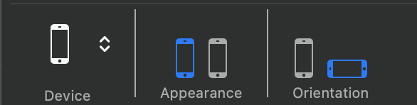
Display options
Define the display options for your application, portrait and/or landscape.
The settings are made in the General tab, Deployment Info part of your project.
iPhone Portrait orientation
Start your project with the preferred orientation, here portrait mode.
Adding constraints to views, only in portrait orientation.
iPhone Landscape orientation
For the landscape orientation, we will create one or more interface variations.
iPhones have several screen widths (compact and regular).
For more informations : Size classes
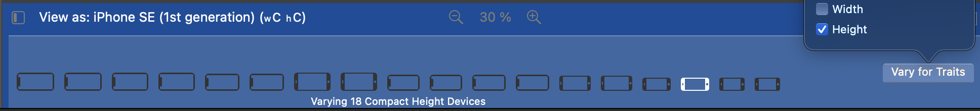
In landscape orientation, (with a compact height), the iPhones are :
Compact except for +.
Regular when they are + (7+, 8+, ...)
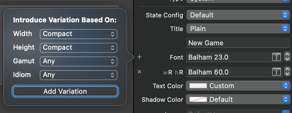
In the storyboard, select an iPhone model, then the landscape orientation.
Click on the Vary for Traits button. A pop-up appears.
By selecting Height, all iPhones in landscape orientation are affected by this variation.
If you also select Width, only Compact iPhones are selected.
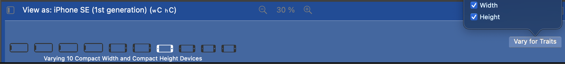
When your variation is defined, the template area turns blue.
A new interface can be created for the selected iPhones.
Simply select the constraint to be changed on the view, and deactivate it with the delete key. A new constraint must be created to respect the landscape view.
For example, a view that is horizontally centred in portrait can become vertically centred in landscape.
Be careful not to permanently delete the previously created constraint.
When a constraint is selected in the view, it is highlighted in grey in the tree on the left. Before deactivating this constraint, make sure it is not highlighted in blue in the tree view, otherwise it will be deleted. When a constraint is deactivated, it becomes greyed out in the Tree View (the constraint logo is no longer blue).
Labels can be added, they will only appear in the version concerned.
For example, for iPads, you can indicate that the application is in the iPad version on the launch page.
When your landscape interface has all its new constraints, click the Done vary button to save your variation.
Customizable Attributes
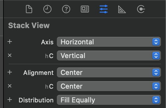
In addition to the constraints, some attributes may also vary depending on the size of the display.
For example, a horizontal stackView can be vertical in landscape orientation.
All attributes marked with a small + can be varied.
By clicking on them, a new variation is created, a pop-up window appears, in which the size category can be selected.
A new line appears for the new values of the attribute in this variation.
Easy way
Group elements into horizontal or vertical Stack View.
Then apply only the constraints on the Stack View.
Stack Views can be nested.
For the different orientations, the axis of the Stack View is customised in the attributes.
Multiplier
The attribute multiplier allows to keep a proportion between two views.
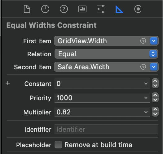
For example, a view will always be proportional to the safe area. If the multiplier is 0.82, the width of the view will be 82% the width of the safe area.
So if the width of the safe area is 766 (iPhone 12), the width of the view will be 628.
And on an SE (2020) with a width of 667, the width of the view will be 547.
This is very useful to keep a square view defined with a width/height ratio.